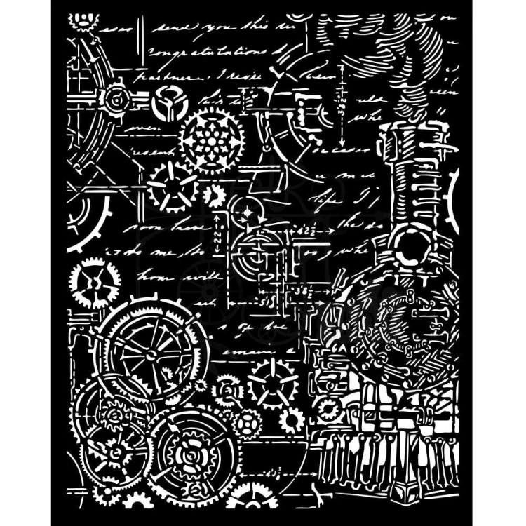
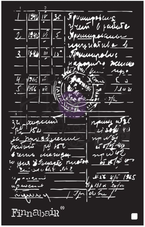
poniedziałek, 13 kwietnia 2026

„Sweet Celebration”

Osiemnastka to wyjątkowy moment – pełen marzeń, planów i pierwszych dorosłych kroków. Z tej okazji powstała kartka stworzona specjalnie dla miłośniczki koni – delikatna, romantyczna i pełna subtelnych detali. Bazą projektu jest najnowsza kolekcja papierów UHK Gallery „Sweet Celebration”, która zachwyca pastelową kolorystyką i lekkim, dziewczęcym klimatem. To właśnie ona nadaje całości miękkości i elegancji, idealnie wpisując się w charakter tej szczególnej okazji.
Kompozycję wzbogaciłam o elementy wycięte z arkuszy ScrapAndMe „Lovely Day in Blue” – najnowszej kolekcji, która oferuje mnóstwo pięknych dodatków do budowania przestrzennych dekoracji. Kwiaty, drobne detale i warstwowe dodatki tworzą bogatą, ale wciąż harmonijną całość. Główną rolę gra tutaj oczywiście koń – wycięty z arkusza ślubnego ScrapAndMe. Subtelnie ozdobiony kwiatową dekoracją, staje się symbolem pasji i wolności, a jednocześnie nadaje kartce wyjątkowego, osobistego charakteru. Nie mogło zabraknąć także ulubionych wykrojników od ScrapAndMe – to właśnie dzięki nim kompozycja nabiera lekkości i finezji. Ażurowe detale pięknie przełamują warstwy i dodają pracy przestrzeni. Całość utrzymana jest w romantycznym, pastelowym klimacie z nutą vintage. To kartka, która nie tylko celebruje osiemnaste urodziny, ale też opowiada historię – o pasji, marzeniach i wyjątkowości chwili.
Mam nadzieję, że taka forma będzie piękną pamiątką na długie lata 

Turning 18 is a special moment—full of dreams, plans, and first steps into adulthood. To mark the occasion, we’ve created a card designed especially for a horse lover—delicate, romantic, and full of subtle details. The foundation of the project is the latest UHK Gallery paper collection, “Sweet Celebration,” which delights with its pastel colors and light, girly vibe. It’s this collection that lends the whole design softness and elegance, perfectly matching the character of this special occasion.
I enriched the composition with elements cut from ScrapAndMe’s “Lovely Day in Blue” sheets—the latest collection, which offers plenty of beautiful embellishments for creating dimensional decorations. Flowers, tiny details, and layered embellishments create a rich yet harmonious whole. The star of the show here is, of course, the horse—cut out from a ScrapAndMe wedding sheet. Subtly adorned with floral embellishments, it becomes a symbol of passion and freedom, while also giving the card a unique, personal touch. Of course, we couldn’t leave out our favorite ScrapAndMe dies—it’s thanks to them that the composition gains lightness and finesse. The openwork details beautifully break up the layers and add depth to the design. The whole piece is kept in a romantic, pastel style with a touch of vintage. This is a card that not only celebrates an 18th birthday but also tells a story—about passion, dreams, and the uniqueness of the moment.
I hope this design will be a beautiful keepsake for years to come 


środa, 8 kwietnia 2026

Ink-resist rub-on w art journalu - tutorial

Lubię efekt, jaki można osiągnąć dzięki użyciu pudrów do embossingu i mediów, jednak zazwyczaj muszę się bardzo z tym namęczyć. Dlatego koniecznie musiałam wypróbować rub-onsy 49&Market - użyta w nich technika ink-resist pozwoliła mi uzyskać podobny efekt bez wyciągania nagrzewnicy i rozsypywania wszędzie dookoła pudru do embossingu...  

Zapraszam na krótki tutorial.

I like the effect you can achieve with embossing powders and media, but it usually takes a lot of effort. That’s why I necessarily had to try out the 49&Market rub-ons – the ink-resist technique used in them allowed me to achieve a similar effect without using a heat gun and scatter embossing powder everywhere...  

Join me for a quick tutorial.


Użyłam:/Used:


środa, 25 marca 2026

Dodatki do junk journala

 Dodatki do junk journala

25.03.2026


Cześć 

Dziś chcę Was zainspirować do tworzenia dodatków do junk journala z kolekcją Art Journal od Elizabeth Craft Designs, pełna pięknych stron ze starych zeszytów, ksiąg rachunkowych, notesów. W kolekcji znajdziecie też zdjęcia vintage i inspirujące napisy. Ja postanowiłam wykorzystać ją do stworzenia junk journala a na razie przygotowałam takie dodatki, które wykorzystam do tworzenia stron . Do budowania kompozycji wybrałam też dodatki z pasków od Tima Holtza,  które wprowadziły do pracy kolory.  Takie prace to fajny sposób na przygotowanie do większego projektu. 

Hi 

Today I want to inspire you to create junk journal embellishments using the Art Journal collection from Elizabeth Craft Designs, which is full of beautiful pages from old exercise books, account books and notebooks. The collection also features vintage photos and inspiring quotes. I’ve decided to use it to create a junk journal, and for now I’ve prepared some embellishments that I’ll use to create the pages. To build the composition, I’ve also chosen embellishments from Tim Holtz’s strips, which have added a splash of colour to the project. Projects like this are a great way to prepare for a larger project


Użyłam/ I Used


Pozdrawiam 


poniedziałek, 23 marca 2026

Szepty wiosny - świąteczna zawieszka z nutą retro

Czasem najpiękniejsze dekoracje powstają z połączenia delikatności i nuty nostalgii .
Te wyjątkowe zawieszki stworzyłam na bazie HDF Artistiko, uzupełniając je kwiatami z tej samej kolekcji. Uroczy motyw króliczka pochodzi z papieru ryżowego od Alchemy of Art, który nadaje całości subtelny, wiosenny klimat. Efekt postarzenia uzyskałam dzięki farbom Cadence – to one nadały pracy charakteru i lekkiej patyny, którą tak bardzo lubię. Na koniec dodałam detal w postaci stempla Stamperii, który pięknie dopełnił kompozycję. To małe formy, ale pełne uroku i ciepła – idealne na wiosenno/świąteczne dekoracje lub prezent.
Jak Wam się podoba taki styl?

Sometimes the most beautiful decorations are created by combining delicacy with a touch of nostalgia.I created these unique pendants using Artistiko HDF as a base, complementing them with flowers from the same collection. The charming bunny motif comes from rice paper by Alchemy of Art, which gives the whole piece a subtle, spring-like feel. I achieved the distressed effect using Cadence paints—they gave the piece character and that light patina I love so much. Finally, I added a detail in the form of a Stamperia stamp, which beautifully completed the composition. These are small forms, but full of charm and warmth—perfect for spring/holiday decorations or as a gift. How do you like this style?