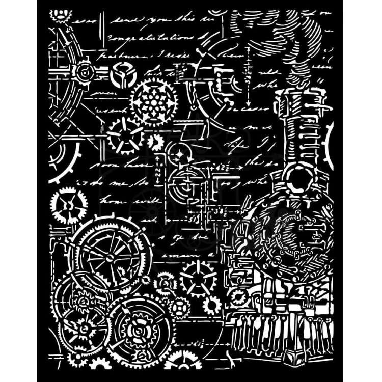
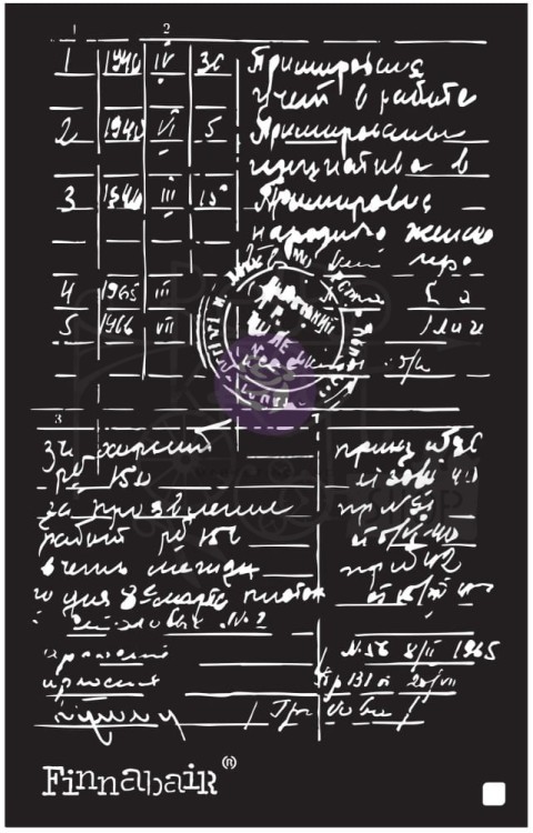
środa, 29 kwietnia 2026

Wiedeńska secesja z kolekcją Artemis

Wiedeńska secesja z kolekcją Artemis


Cześć 

Wiedeńska secesja, niesamowity okres w sztuce, malarstwie, architekturze czy sztuce użytkowej a jeśli kiedyś będziecie w Wiedniu koniecznie odszukajcie jej ślady. To również moje pierwsze skojarzenie kiedy zobaczyłam niezwykłą kolekcję Ciao Bella -Artemis . W kolekcji znajdziecie papiery scrapowe, papiery ryżowe, naklejki które pięknie nawiązują do tego stylu. 
Ja postanowiłam użyć jej na prostej ramce, która idealnie wydobywa piękno szczegółów i oczywiście użyłam butelkowej zieleni, która dla mnie jest kolorem secesji. Na pewno jeszcze sięgnę po te papiery bo są naprawdę wyjątkowe.

 Hi

Viennese Art Nouveau – an incredible period in art, painting, architecture and applied arts. If you ever find yourself in Vienna, be sure to seek out its traces. That was also my first thought when I saw the extraordinary Ciao Bella – Artemis collection. The collection features scrapbooking papers, rice papers and stickers that beautifully evoke this style. 
I decided to use it on a simple frame, which perfectly brings out the beauty of the details, and of course I used bottle green, which for me is the colour of Art Nouveau. I’ll definitely be reaching for these papers again as they’re truly unique.


Użyłam/ I Used 


(podobny szablon)


Pozdrawiam 


poniedziałek, 27 kwietnia 2026

Art journal – opowieść zamknięta w ramach / Art journal – a story captured within the frame

Ten wpis powstał ponownie w moim ulubionym media journalu – i po raz kolejny przekonuję się, jak bardzo lubię wracać do tych samych stron, odkrywając je na nowo. W tym wpisie pozwoliłam sobie na odrobinę bardziej wyraziste tło. Głębokie, przygaszone zielenie przełamane szarością, brązem i delikatnymi przetarciami stworzyły bazę, która przypomina stare, lekko zapomniane ściany – takie, które mają swoją historię do opowiedzenia. Pracę zaczęłam od warstw gesso, a następnie budowałam kolor przy użyciu farb akrylowych. Stopniowo dokładałam kolejne warstwy: odbicia stempli, subtelne tekstury i przetarcia, które nadały całości charakteru i głębi. Brzegi przyciemniłam, dzięki czemu wpis nabrał bardziej zamkniętej, intymnej formy. Tym razem kompozycję oparłam na motywie ram i okien – elementów, które symbolicznie zatrzymują chwile. Po lewej stronie pojawia się spokojna, domowa scena – filiżanka, rośliny i miękkie światło wpadające przez okno. Po prawej – bardziej dekoracyjna kompozycja z ramkami, kwiatami i delikatną postacią, która dodaje całości nuty baśniowości. Wykorzystałam elementy papierowe oraz detale, które subtelnie łączą obie strony w jedną historię – o codziennych momentach, marzeniach i tym, co ulotne. Napis „Life needs big dreams” idealnie dopełnia tę opowieść – przypomina, że nawet w spokojnych, cichych chwilach kryje się przestrzeń na coś większego. To jeden z tych wpisów, w których najważniejsza była dla mnie atmosfera – budowana powoli, warstwa po warstwie. Art journaling w takim wydaniu to nie tylko tworzenie kompozycji, ale też zatrzymanie się na chwilę i wsłuchanie w siebie.


This entry was created once again in my favorite media journal - and once again, I realize just how much I enjoy returning to the same pages and rediscovering them. In this entry, I allowed myself to use a slightly more striking background. Deep, muted greens broken up by gray, brown, and delicate distressing created a base that resembles old, slightly forgotten walls - the kind that have a story to tell. I started the piece with layers of gesso, then built up the color using acrylic paints. I gradually added more layers: stamp impressions, subtle textures, and distressed effects that gave the whole piece character and depth. I darkened the edges, giving the post a more enclosed, intimate feel. This time, I based the composition on the motif of frames and windows - elements that symbolically capture moments. On the left is a peaceful, homey scene - a cup, plants, and soft light streaming through the window. On the right - a more decorative composition with frames, flowers, and a delicate figure that adds a touch of fairy-tale magic to the whole. I used paper elements and details that subtly weave both sides into a single story - about everyday moments, dreams, and the fleeting nature of life. The phrase “Life needs big dreams” perfectly complements this narrative - it reminds us that even in calm, quiet moments, there’s room for something greater. This is one of those entries where the atmosphere was most important to me - built slowly, layer by layer. Art journaling in this form isn’t just about creating a composition, but also about pausing for a moment and listening to yourself.


poniedziałek, 20 kwietnia 2026

Layout w fioletach/A purple-themed layout

Urzekła mnie kolekcja "Plum&petal" od 49&Market. Gdy tylko ją ujrzałam, wiedziałam, że z tych papierów i dodatków stworzę warstwowy layout. 

I was captivated by the ‘Plum&petal’ collection from 49&Market. As soon as I saw it, I knew I’d use these papers and embellishments to create a layered layout. 


Użyłam:/Used: